I learned how to make power points and infographic well. I never learned how to make a power point when I was young. So it was hard to make a high quality powerpoint. This is because many principles have not been adhered to.
I learned how to make infographics in Kanba. Infographic is a powerful tool for organizing, presenting, and telling stories. We can always see all kinds of infographic in our daily lives, which can increase people’s interest in reading and watching.
I think it is very important in learning that learning content can attract people’s attention. This is because it can increase the efficiency of learning and visual assistance is very helpful. I think it is very applicable to life as well as study. The infographic provides a set of important information and combines some color matches with photos for better results.
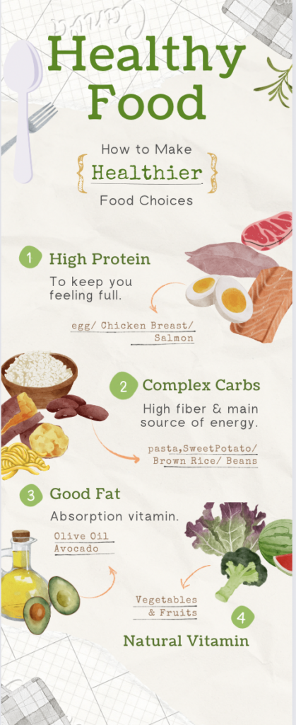
I used Canva to make an infographic about how to be healthier by choosing food, which includes a total of 4 things to consider. I have summarized four steps because it contains enough knowledge points for readers to understand the choice, and i only put four essential things to let readers not be bored. I chose green as the theme color by giving some points, such as the title and numbers. Moreover, I put plain ivory color to be simple. At the same time, I have provided a relevant, simple picture for each topic, which allows readers to get a general understanding before reading the content carefully. The text content is mainly key words.
Design principles within infographic
Alignment ensures the design arrangement is captivating, organized, and connected (Adobe, 2020).
I constructed a pattern by moving the image back and forth to the right left. The title was emphasized in a larger size and the font size of the rest of the subject was adjusted. I also tried to make the image size similar too.
Hierarchy puts forth the idea that when there are various images, the most important images containing an important message should stand out (Adobe, 2020).
i used black and green colours in tittle to emparize the topic healthier
Repetition refers to repeating colours, fonts, and shapes to make the format more visually appealing (Adobe, 2020).
i used green colour for the tittle and topics also give the green colour numbers to let readers follow easily
Proximity refers to the grouping of related components to benefit the structure and organization of the design (Adobe, 2020).
i put some words right side and left side by giving sequences.
Negative space is purposefully leaving blank space within the design to assist in emphasizing the most important information (Adobe, 2020).
I tried to use just words not a sentence to keep empty space.
Leave a Reply
You must be logged in to post a comment.